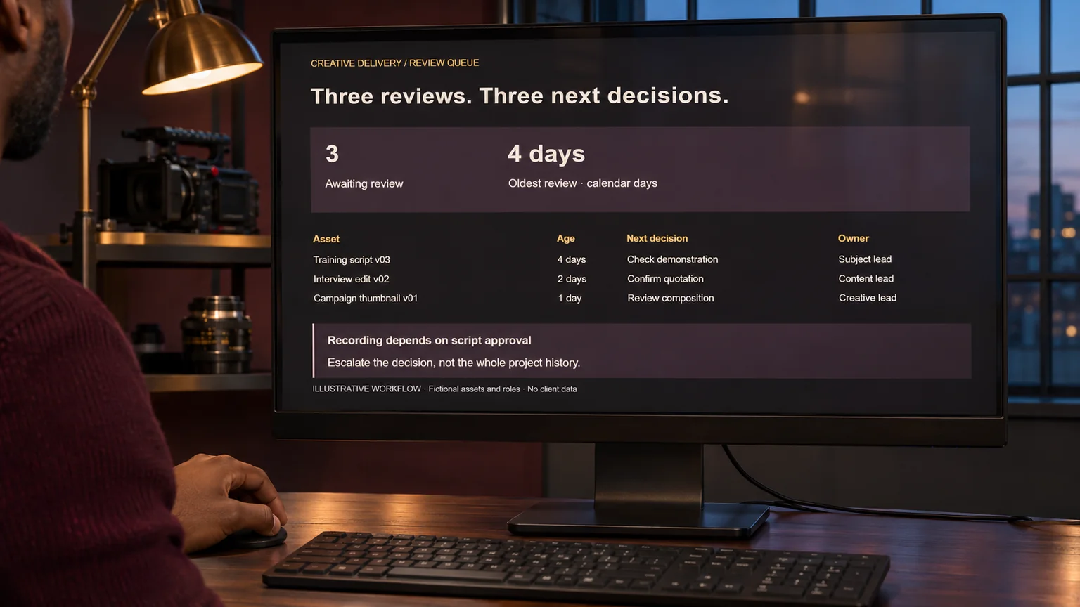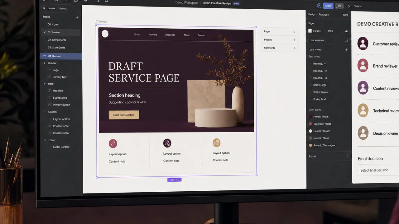

Words such as premium, authentic and dynamic can describe very different pictures. Before producing a large visual set, I would use one deliberately chosen test frame to expose those differences. The purpose is to settle a decision, not to make a miniature finished campaign.
Imagine a fictional professional-services website needing photographs of project coordination. The owner wants natural working scenes, while the first proposed image resembles a staged technology advertisement. I would turn that mismatch into specific review questions before making another twenty images.
I choose a frame that contains the difficult decisions

The test should show the elements most likely to cause disagreement: the working environment, the person, the device scale and the relationship between the screen and the photograph. A beautiful close-up of a coffee cup would tell me very little about those requirements.
I would write down what the frame is testing. For this example, the questions are whether the work is recognisable, whether the monitor looks physically plausible and whether the colours feel natural. That keeps the review from drifting into unrelated preferences.
I make the intended use visible
I would show the frame in the actual page position, with the expected heading and responsive crop. A photograph that works as a full-width desktop background may lose its subject in a narrow mobile crop. The composition needs to survive the intended use.

W3C recommends evaluating accessibility early and throughout development. I would include readable text and meaningful image context in this early review rather than postpone them until the visual set is complete. W3C evaluation overview. A test frame is not a complete accessibility assessment.
I ask for observable feedback
Instead of asking whether the owner likes the image, I would ask which part communicates the intended work and which part feels implausible. Feedback such as the dashboard is too large gives the next revision a concrete target.

I would preserve the distinction between a preference and a factual defect. An impossible device angle needs correction. A choice between two natural shirt colours may be an aesthetic decision. Both can be recorded, but they should not compete as though they have the same consequence.
I revise the rule, not only the picture
If the owner rejects oversized interfaces, I would update the production brief to require normal software density and device proportions. Fixing only the test image would leave the next prompt free to reproduce the same problem.

The revised brief would retain examples of what passed and why. I would describe the accepted working characteristics rather than instruct every image to copy the same room, clothing or palette. Consistency should not remove the variety that makes the collection believable.
I use acceptance to control the larger set
Once the test frame answers the main questions, I would review the remaining images against those criteria. Each still needs inspection for anatomy, interface coherence, relevance and crop behaviour. Acceptance of one frame does not certify every later output.
For a generated scene, I would also keep its illustrative status clear in the editorial record. A realistic office photograph should not become evidence of a client engagement that never occurred. The image can explain a proposed workflow without making that claim.

My aim is to discover the expensive disagreement while the correction is still small. A useful test frame gives the owner something concrete to judge and gives the production team a repeatable standard for the work that follows.
Research and example note
Prepared for 14 November 2026. The website and review scenario are fictional. W3C supports the limited early-evaluation principle; the visual review method is an original production proposal.