Multimedia Strategy · 2026-02-23 · 6 min read
A short attention window does not justify louder, faster and more cluttered content. It requires a clearer first promise and a better path for the customer who chooses to continue.
Adobe’s 2026 research reports that promotional content in social media, digital advertising and email may have only two to five seconds to earn attention. The practical temptation is to respond with more movement, more copy, more visual effects and a louder opening.
I take the opposite approach. A short window demands a stronger hierarchy. The audience needs to recognise relevance quickly, understand the first promise and know whether continuing is worth their time.
I plan multimedia content as the beginning of a customer journey, not as an isolated battle for a view. The first seconds open the door; the rest of the experience must justify the invitation.
Key takeaways
- The first frame or sentence should communicate relevance, not every detail.
- Attention is useful only when the next step fulfils the opening promise.
- Content should be adapted to context rather than copied unchanged across channels.
- Accessibility and comprehension remain quality requirements inside a short format.
- Measurement should follow the journey from attention to understanding and action.
Section 01
The first job is recognition
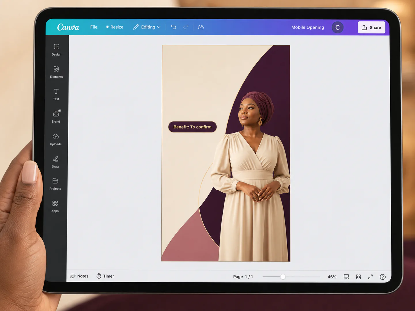
In the opening moment, the audience asks: is this for me, is it useful and can I trust the signal? I establish one recognisable subject, one clear benefit or question and a visual hierarchy that can be understood without effort.
I remove competing messages from the opening. Detail belongs in the next stage, not in the first glance.
Section 02
Relevance is stronger than interruption
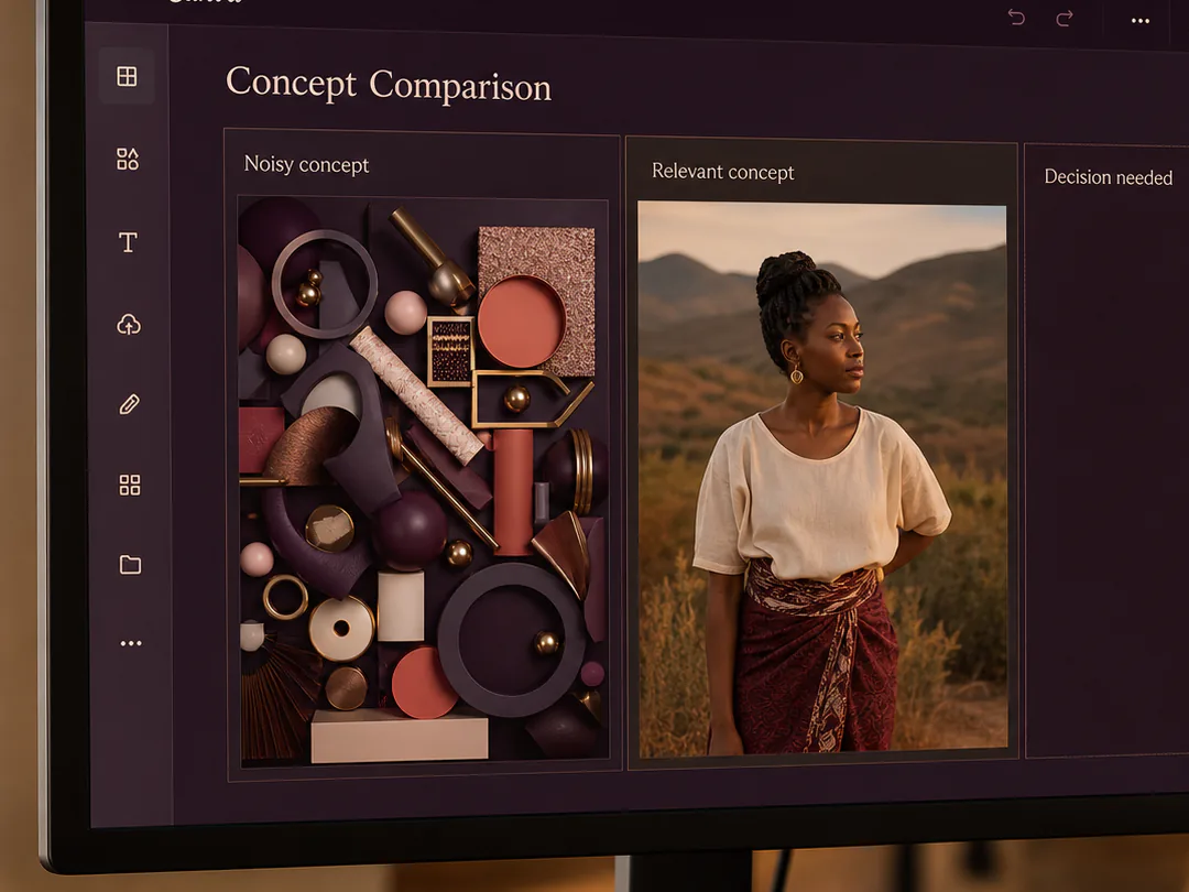
A surprising image may stop a scroll, but it can still fail when it has no honest connection to the offer or audience. I use context, language and imagery that make the relevance visible rather than creating an unrelated spectacle.
The opening should attract the right person, not the largest possible number of people who will immediately feel misled.
Section 03
The content needs a continuation path
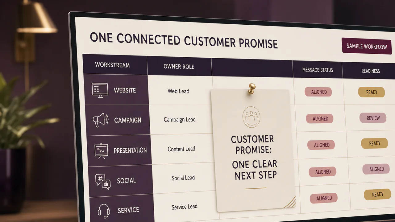
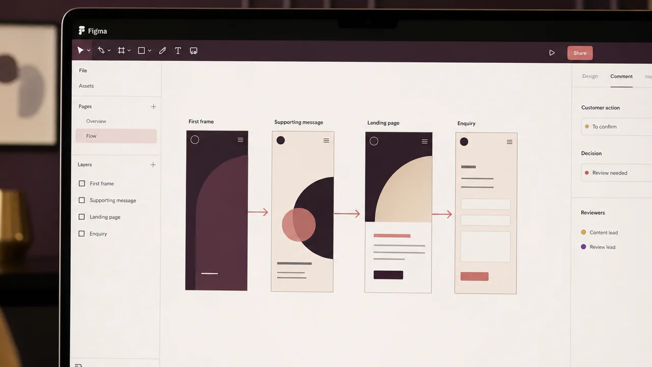
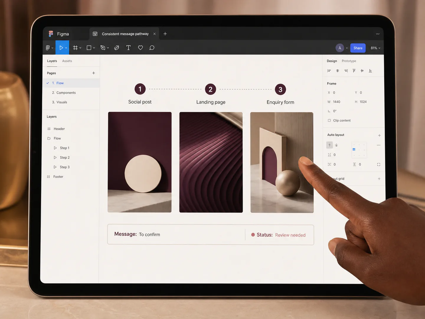
I define what happens after attention: a supporting sentence, a demonstration, a landing page, a conversation, a download or an enquiry. The opening and destination should use the same promise and language.
This prevents a common customer-experience break where a strong creative asset leads to a page or process that does not answer the question it created.
Bring the moving parts into one delivery process.
I can help turn a customer message into a cross-platform multimedia plan with a clear opening promise, channel adaptations, review criteria and a measurable continuation path.
Section 04
Each channel changes the first seconds
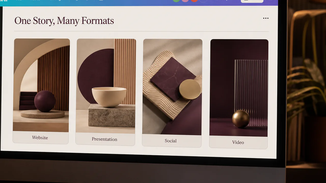
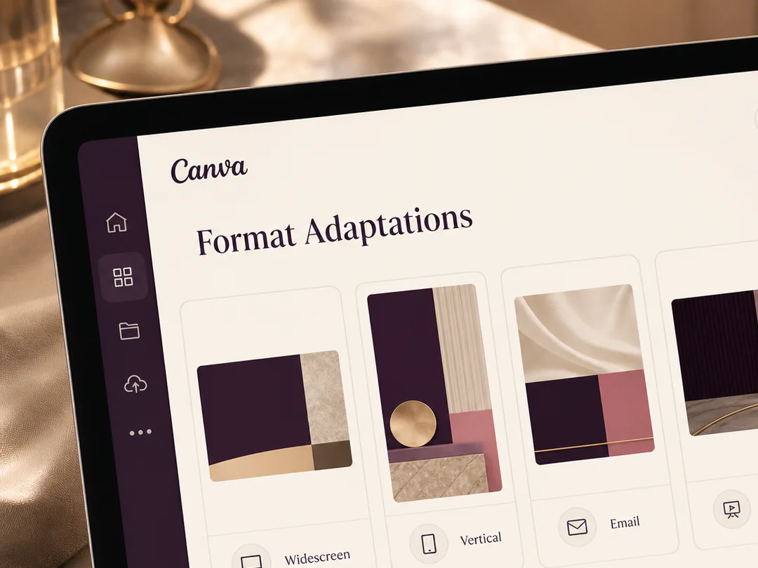
A website hero loads into an intentional visit. A social post appears between unrelated content. A presentation opening has a known audience but limited patience. A vertical video may begin with sound off.
I adapt framing, pacing, captions, crop and message density to that context rather than treating one master asset as automatically suitable everywhere.
Section 05
Fast content still needs accessible meaning
Captions, readable type, sufficient contrast, descriptive alt text and a clear visual sequence improve understanding. The key message should not depend on rapid audio, colour alone or a decorative effect that some people cannot perceive.
Accessibility strengthens the opening because it forces the content to communicate through more than one fragile cue.
Section 06
The review should test the promise, not only the look
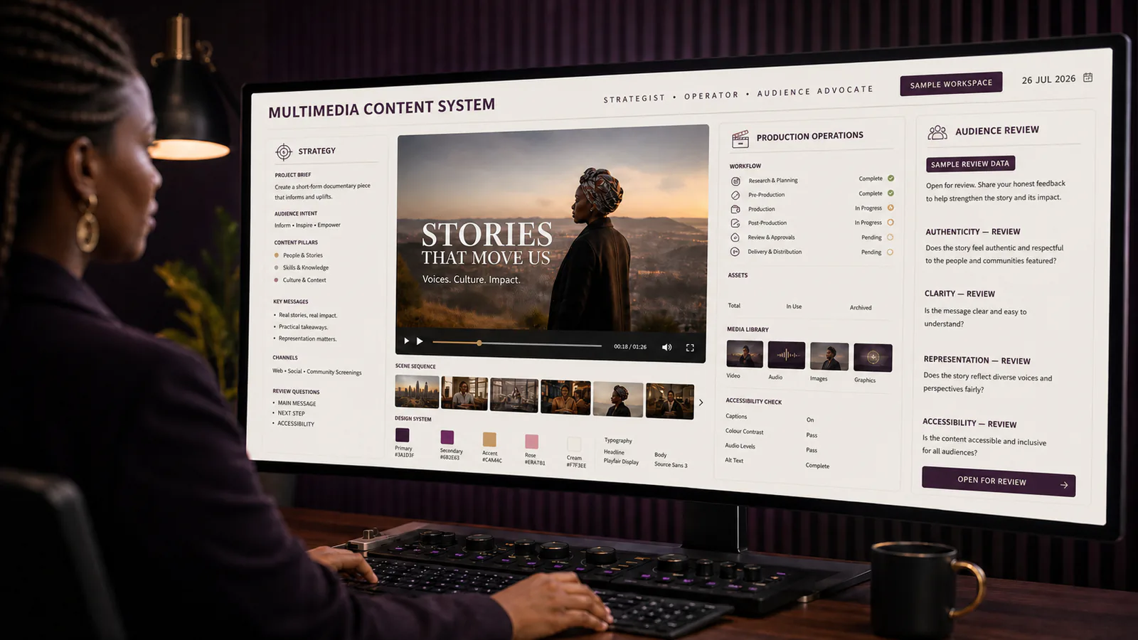
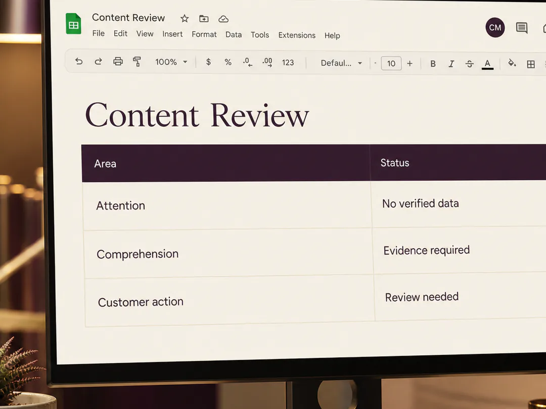
I ask reviewers to identify what they understand in the first seconds, what they expect next and whether the destination fulfils that expectation. This produces more useful feedback than asking whether they “like” the asset.
Where possible, I test versions with representative users or a small internal audience before scaling production.
Section 07
Attention metrics need a customer outcome beside them
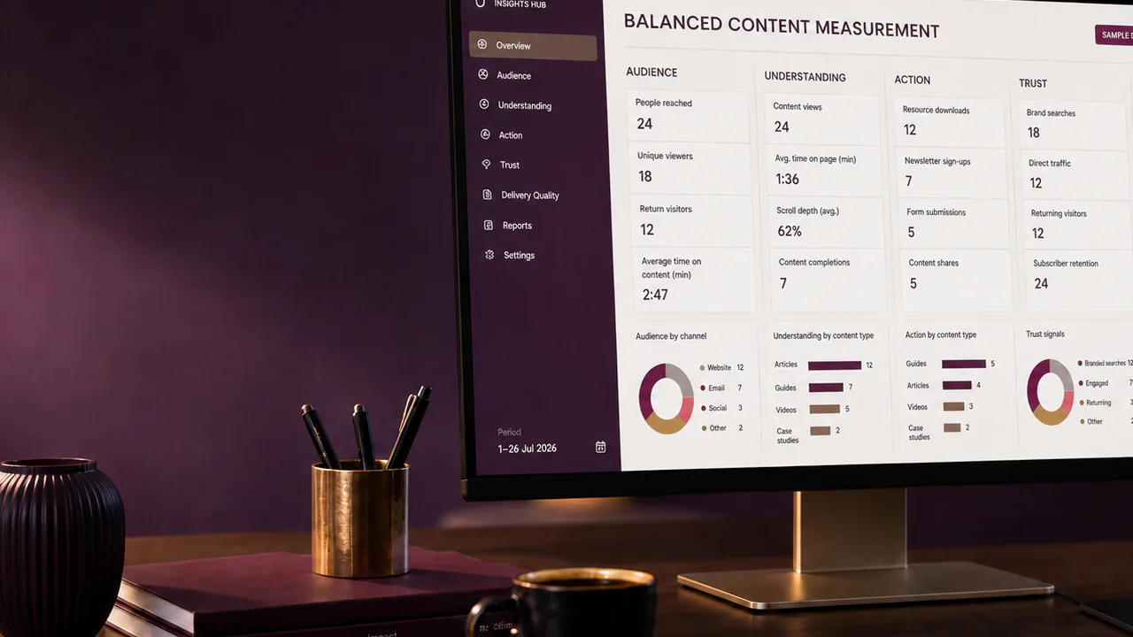
Views, watch time and click-through can show where people continue or leave. They cannot prove that the content was understood, trusted or useful. I connect attention to the next meaningful action: qualified enquiry, completed task, informed decision, content save or repeat use.
That measurement helps the creative team improve the journey rather than merely optimise a hook.
Turn this insight into an organised next step.
Two to five seconds is not a reason to abandon depth. It is a reason to organise depth. The opening should give the audience a fair and compelling reason to continue, then the wider experience must deliver what was promised.
When content receives attention but does not create understanding or action, I can help reconnect the first impression to the complete customer journey.
Start with the short version: the outcome, intended audience, deadline, available assets, stakeholders and the delivery problem that is currently blocking progress.
Sources and related reading
- Adobe — 2026 AI and Digital Trends Report — Customers give promotional content only seconds to earn attention and still expect AI-assisted experiences to feel human and brand-aligned.
- Adobe — 2026 Creative Trends Forecast — The forecast emphasises emotional connection, multisensory work, experimentation, authenticity and local cultural relevance.
- W3C — Web Content Accessibility Guidelines (WCAG) 2.2 Overview — WCAG organises accessible content around perceptible, operable, understandable and robust experiences.